Crafting Editorial Typography on the Modern Web
Optical sizing, modular scales, measure constraints, and typographic hierarchy for distraction-free reading.
Great reading experiences are defined by subtle typographic details. When line lengths extend beyond 75 characters, reading comprehension drops rapidly as eyes struggle to track paragraph returns.
Core Typographic Rules
- The Ideal Measure: Constrain article prose width to 65–70 characters (
max-w-2xlor65ch). - Vertical Rhythm: Set body line-height to 1.75–1.8 for generous breathability between lines.
- Contrast Hierarchy: Pair high-contrast serif headlines with a crisp, neutral grotesque body font.
- Descender Padding: Prevent descender clipping on italic display words with
leading-[1.15]and reserve padding.
Good typography fades into the background, allowing the author's argument to command the reader's full focus.
Architecture & System Visual
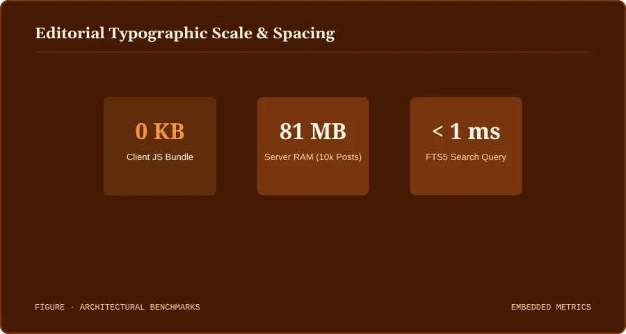
Figure 1: Editorial Typographic Scale & Spacing. Rendered and served directly from local WebP storage.
Discussion
0Leave a Comment
No comments yet.
Be the first to share your thoughts on this article!